GRIMVOXEL
2026
Grimvoxel
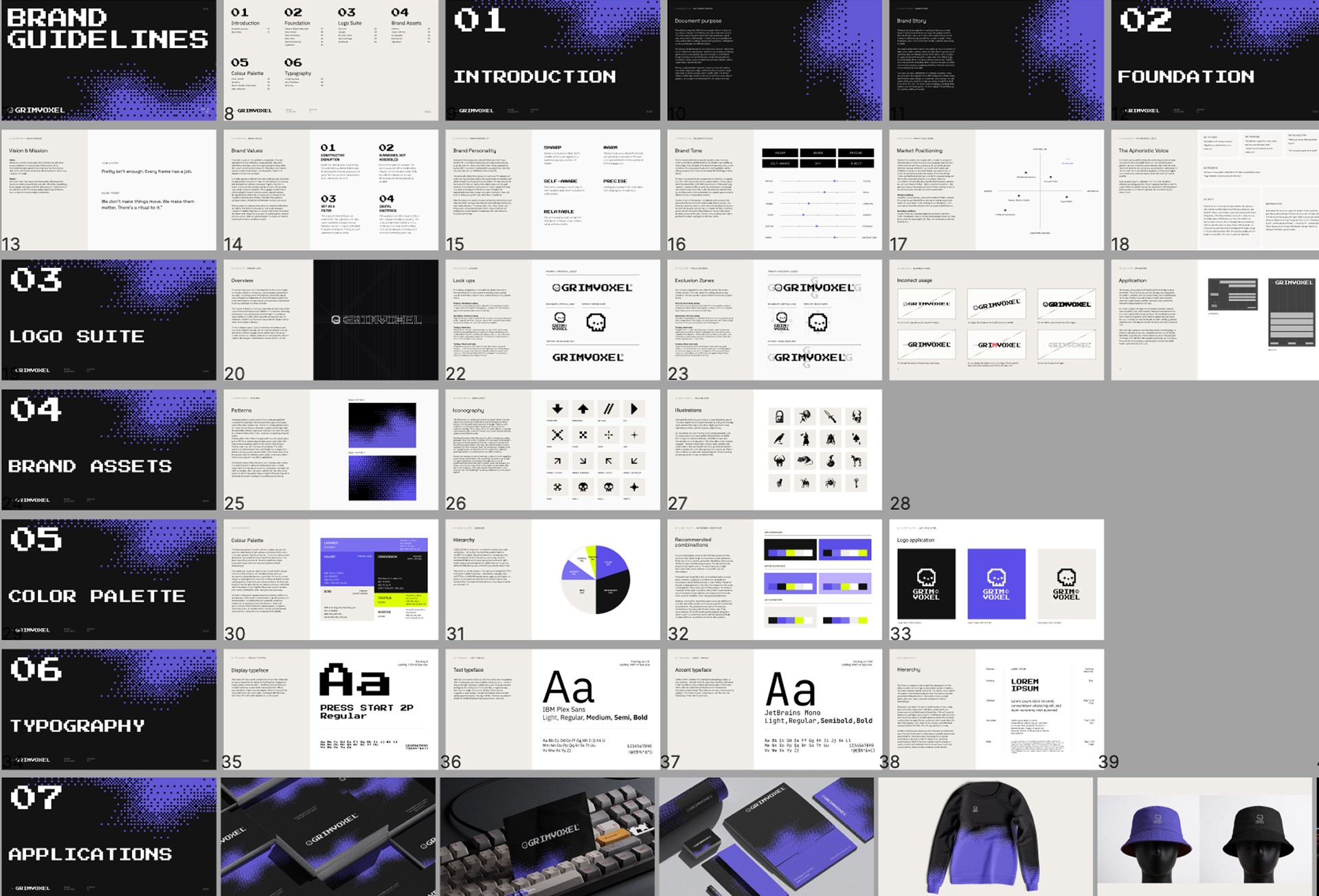
The studio's own identity system. Skull mark, colour architecture, typography, pattern language, and a 33-page grimoire governing all of it. Eight days. The brand designed the way the brand designs.

Role
Brand Designer, Motion Designer, Graphic Designer
Platform
Year
2026
Timeline
8 days
Overview
Project Overview
Grimvoxel is a motion and visual design studio for brands in complex spaces where the wrong visual language costs more than bad code. This project is the studio's own identity system: logo suite, pixel-grid skull mark, colour architecture, typography, pattern system, and a full set of applications. Every element traces back to the same construction logic. Nothing decorative. Nothing safe.
Logo
Four lockups. One grid. Every pixel placed on purpose.


Colour
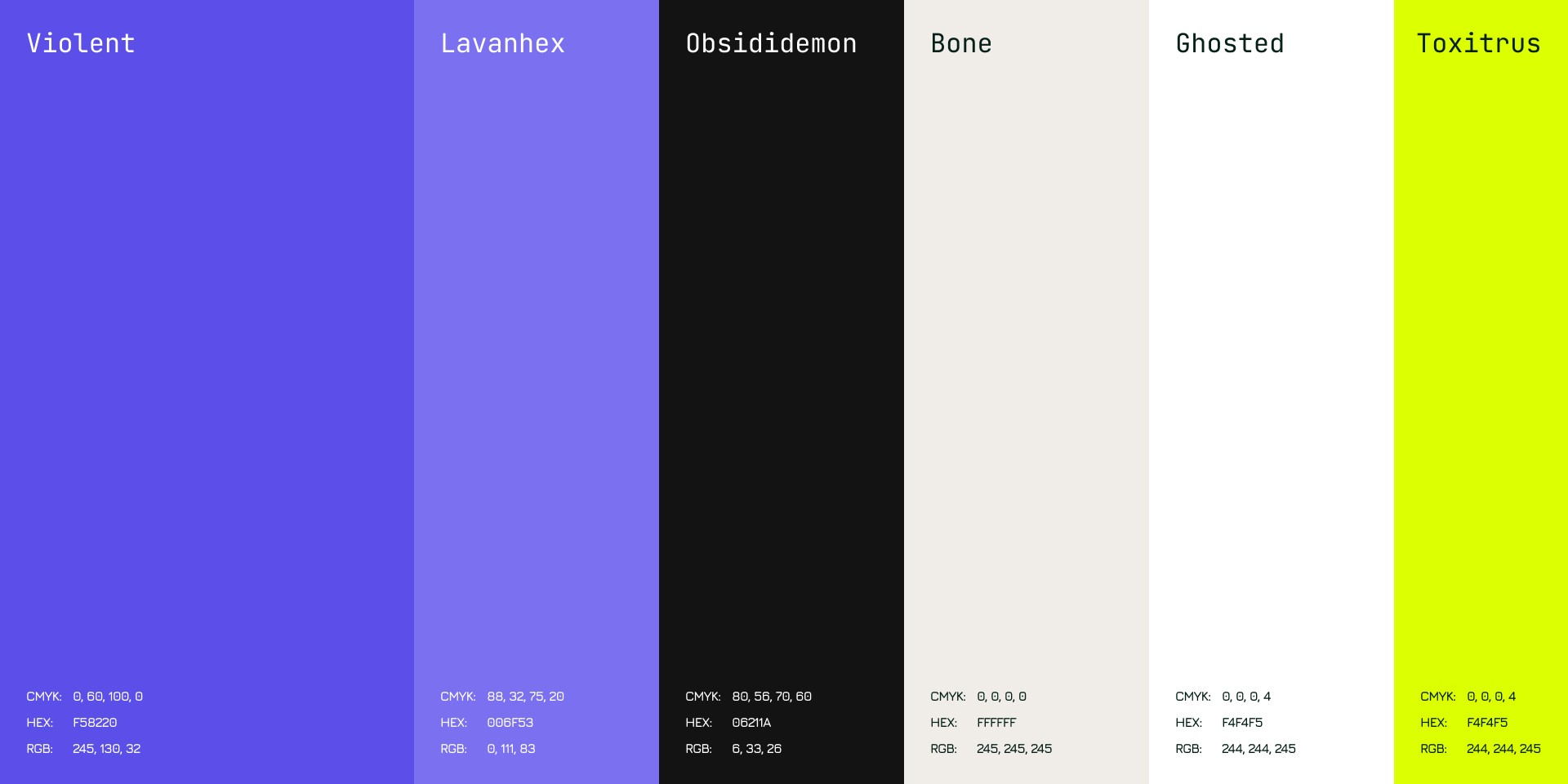
Six colours. Each one knows its job and stays in it.
The palette is dark-first by default, with a clean inversion path to light surfaces when context demands it. Three tiers: primary, neutral, accent.
OBSIDIDEMON is the ground. It carries the majority of any dark composition.
VIOLENT is the signal: one active element per layout, its authority earned through scarcity.
BONE is the skull reference without the literalism, a surface that has aged and carries warmth where the rest of the palette runs cool. TOXITRUS is the flare. It exists to interrupt, once, deliberately.
GHOSTED and LAVANHEX operate at the edges: texture, depth, the parts of a composition that should recede.
The palette was chosen for what it communicates before content is placed on it. Off-black carries depth without the flatness of pure black. Primary purple sits between a digital glow and ritual ink. Together they build a world that feels constructed and inhabited rather than generated and empty.
Typeface
The display voice changed. The system got sharper for it.
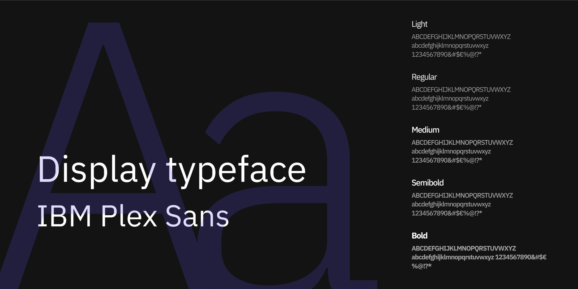
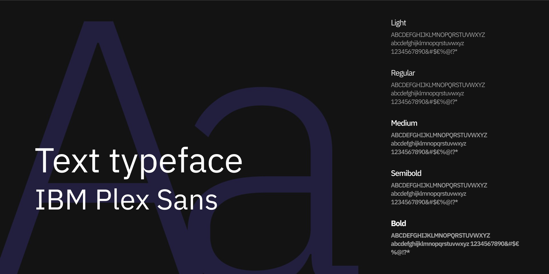
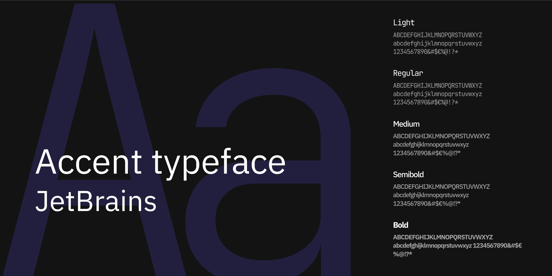
Three typefaces. Three jobs. No overlap.
The display typeface handles headlines and hero moments. It announces the brand without preamble and carries enough visual weight to own a composition at scale. Below display size, it steps aside. That restraint is intentional.
IBM Plex Sans carries everything that needs to be read. Designed by IBM, it brings quiet technical credibility without performing it. Set at 16 to 18px in digital contexts, minimum line height 1.6. The copy matters. The type that carries it should not be the thing that stops someone from reading it.
JetBrains Mono handles the in-between: subheadings, labels, captions, UI text. The connective tissue of mid-hierarchy. Present in most compositions. Noticed by almost nobody. That is the correct outcome for an accent typeface.
The hierarchy follows the golden ratio. Each scale step relates mathematically to the one above it. Not because precision is decorative, but because arbitrary sizing introduces noise the system does not need.
Web
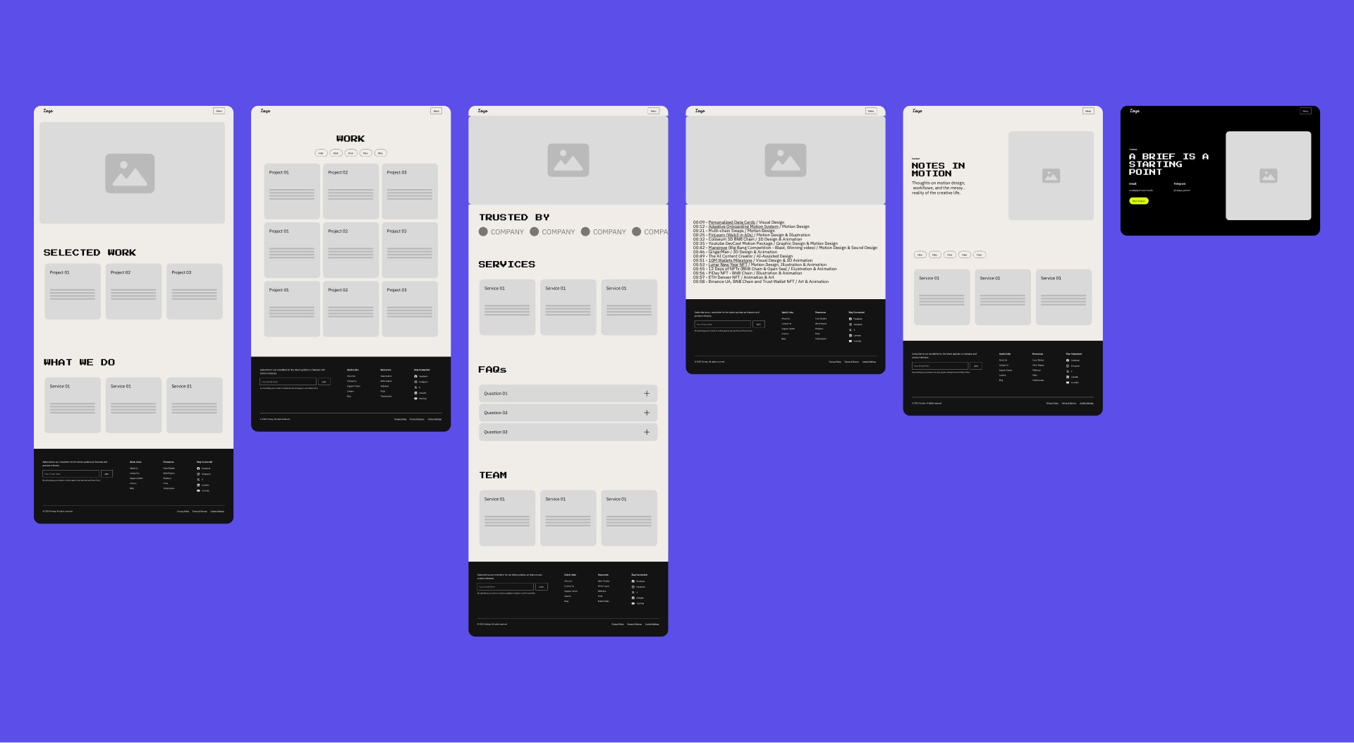
Wireframed first. Designed second. Built in Framer because the grid demanded it.
Low-fidelity wireframes mapped every key screen before a single visual decision was made. Structure, hierarchy, and user flow locked down in greyscale. The wireframes existed to absorb the bad ideas early, where changing direction costs minutes instead of days.
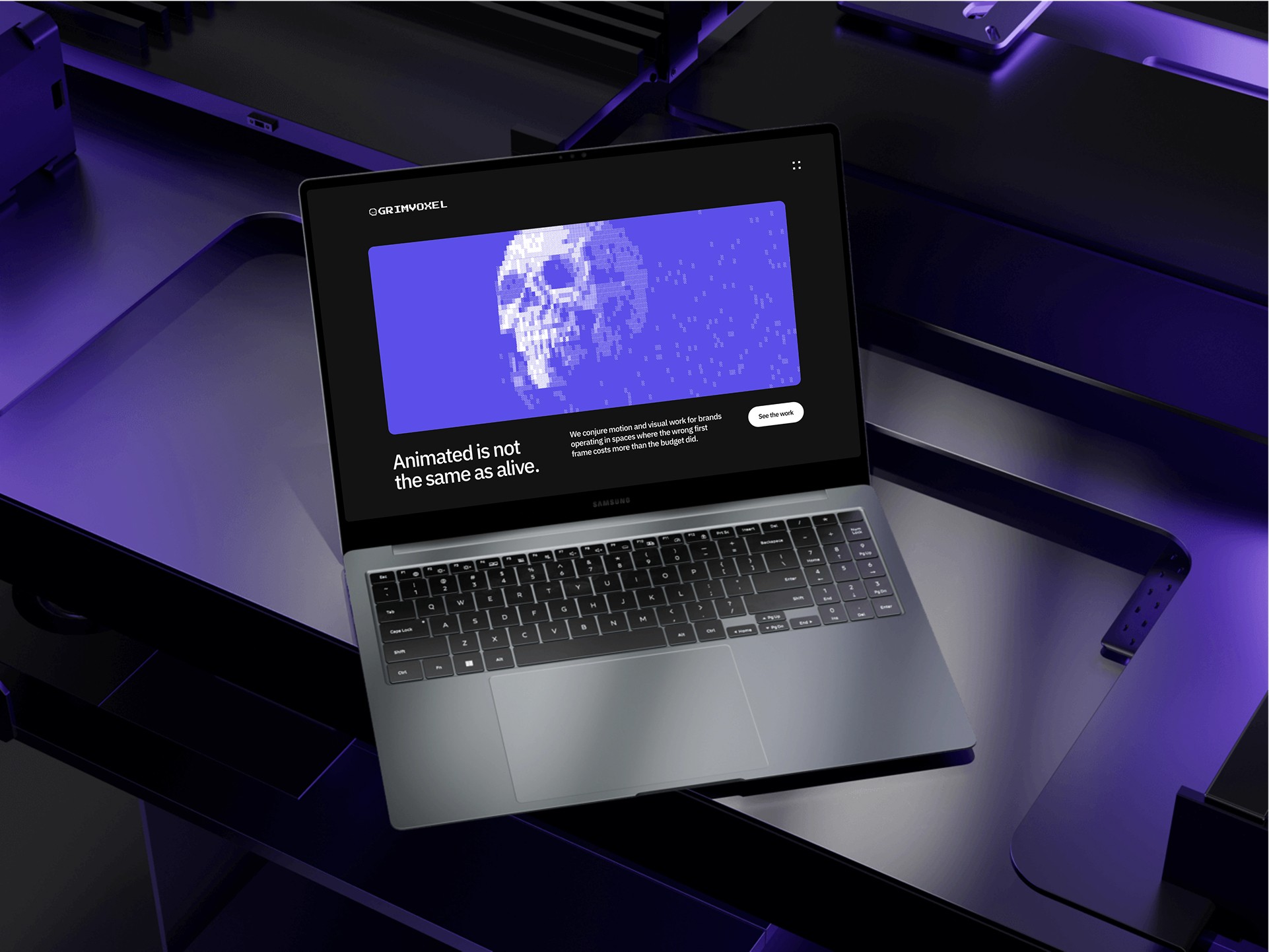
The visual design followed the system already established: OBSIDIDEMON canvas, BONE type, VIOLENT reserved for a single interactive signal per screen. The pixel-grid construction logic of the mark extended into the site's graphic devices, section dividers, and hover states. The website does not reference the brand guidelines. It is the brand guidelines, rendered as a live surface.
Built in Framer. The platform was chosen because the grid-based layout system and component architecture matched the brand's own construction logic. The tool served the system, not the other way around.
Applied
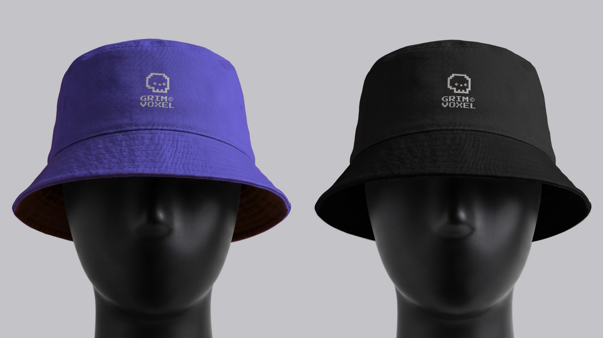
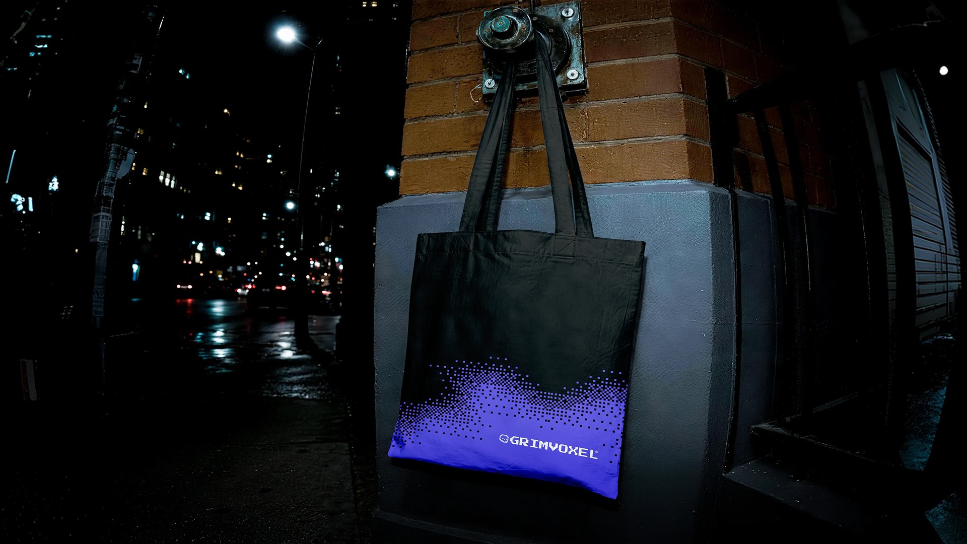
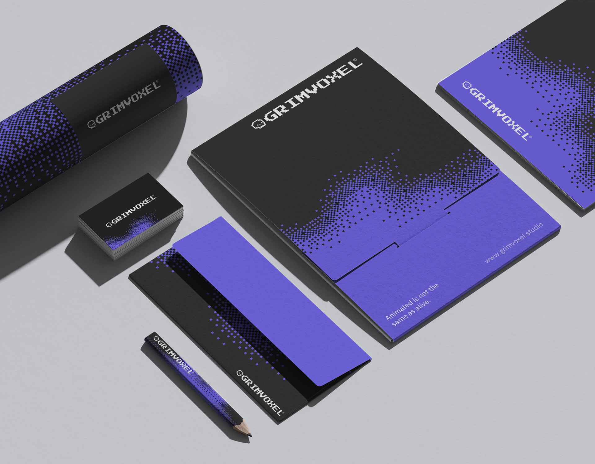
The grimoire exists so the brand survives contact with the real world.



Tools
What built it

Figma

After Effects

Illustrator

Framer